App Refresh
In 2019, as compony grow rapidly, design team was not set up to prepared a design language to ensure we are delivering a cohesive language to users. As the compony grow rapidly with many different PMs launching different features and optimization, As a result, the product had a disjointed experience both UI and UX. As a design team, we didn’t have a clear visual direction and UI language. We decided to take a major design leap and UI revamp.
Timeline
Design: 3 months (Nov 2018- Feb 2019)
Development: from Feb 2019
My role: Project Lead
Team members: 1 Visual designer, 1 UX designer, 1 Motion designer
Background
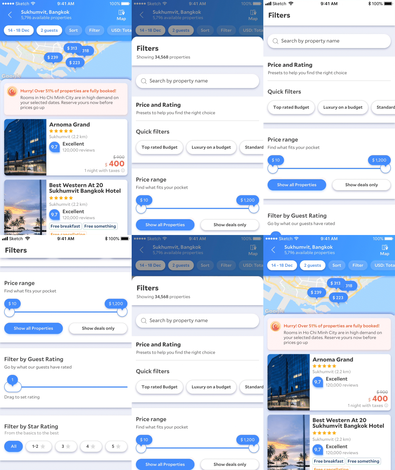
Because high volume of experimentations without Design System in place, Agoda App has become very fragmented in both UI and UX
UX - Filters didn’t carry over from SR
UX - Messaging are all different
UI - 3 different navigation/headers
UI - Hundred of color shades
UI - different buttons/text links
Key Problems
No Defined Language
No unified design language or guiding principles to align design team’s direction causing users don’t recognize agoda’s branding hence no loyalty
AB Testing Culture and Velocity
Fragmented experimentation culture causing legacy and new language coexist
Rapid Growing Business
Product was expanding to multiple funnel (flights/packages) rapidly causing design tradeoffs
The Vision
Best Converting, Yet Beautiful & Lovable
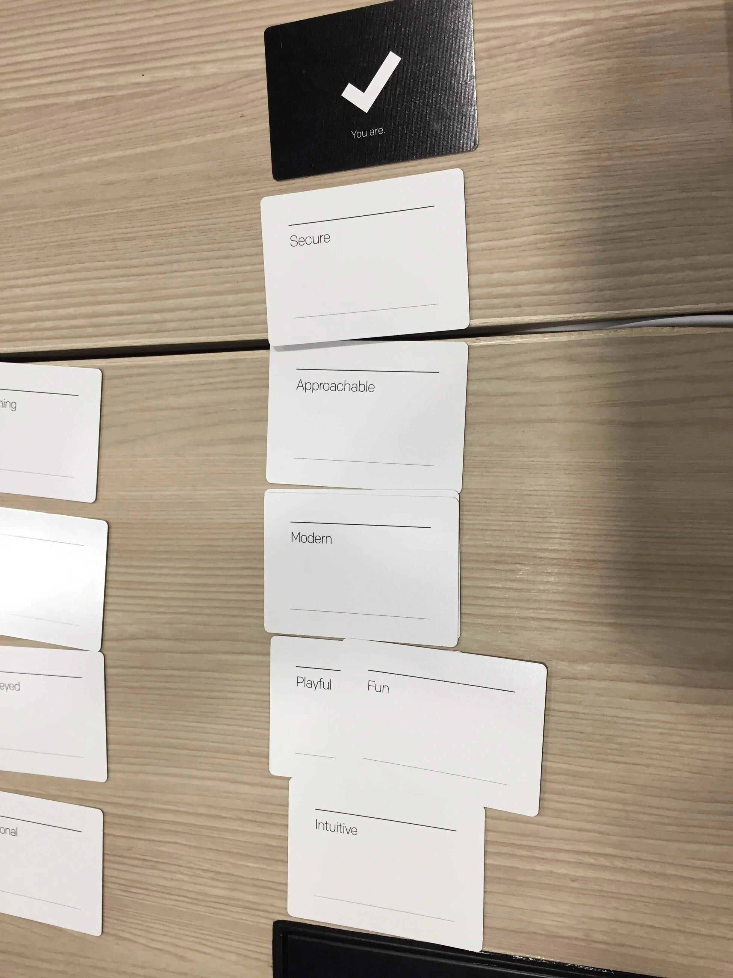
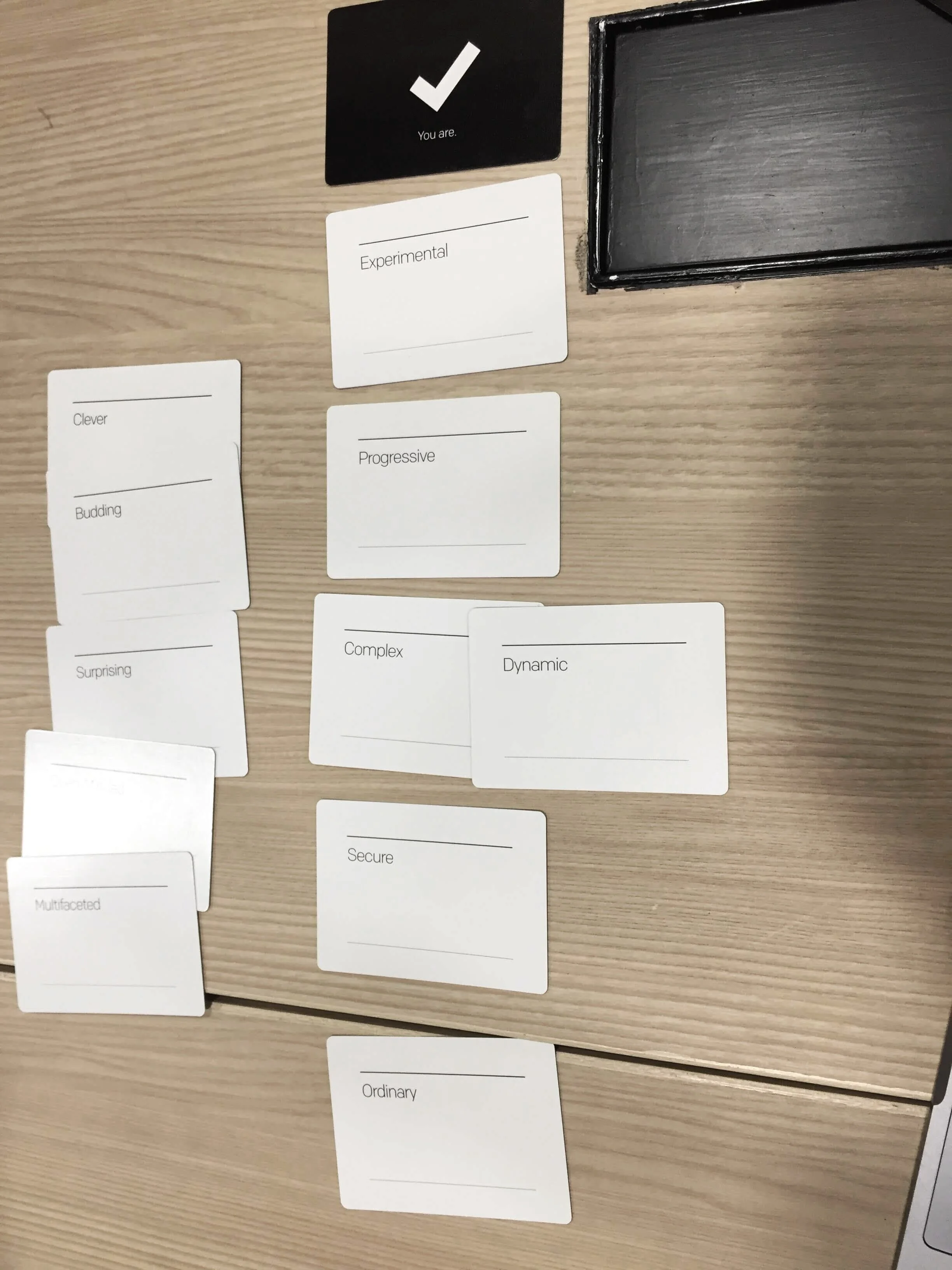
Defining the design principles
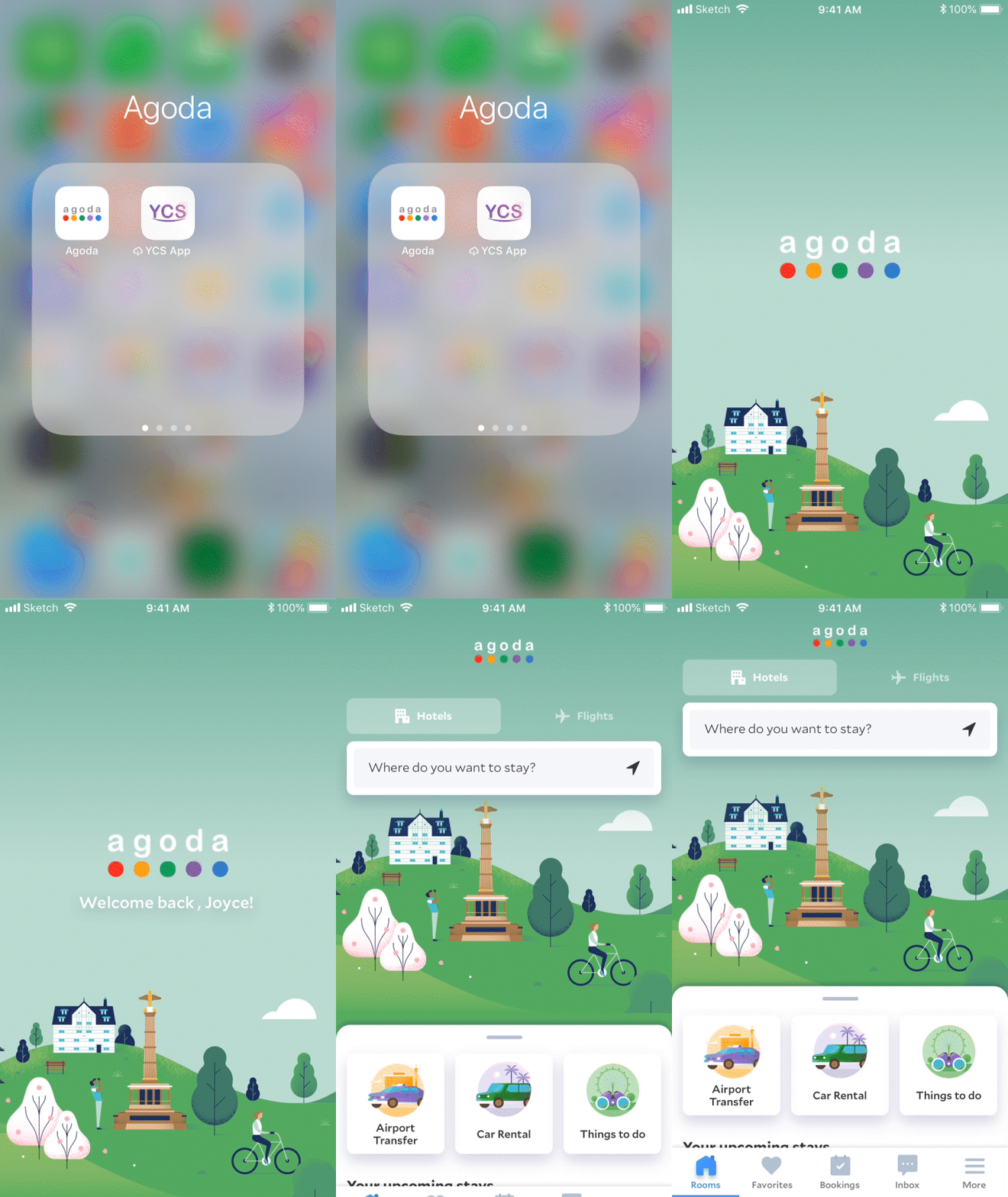
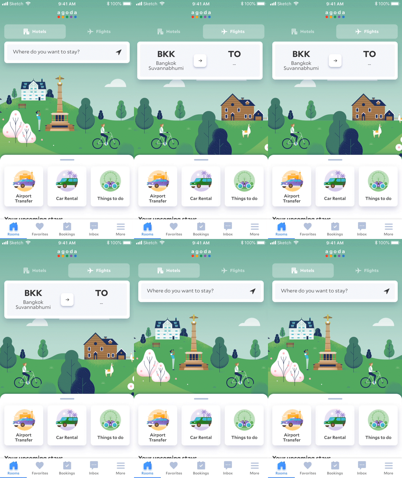
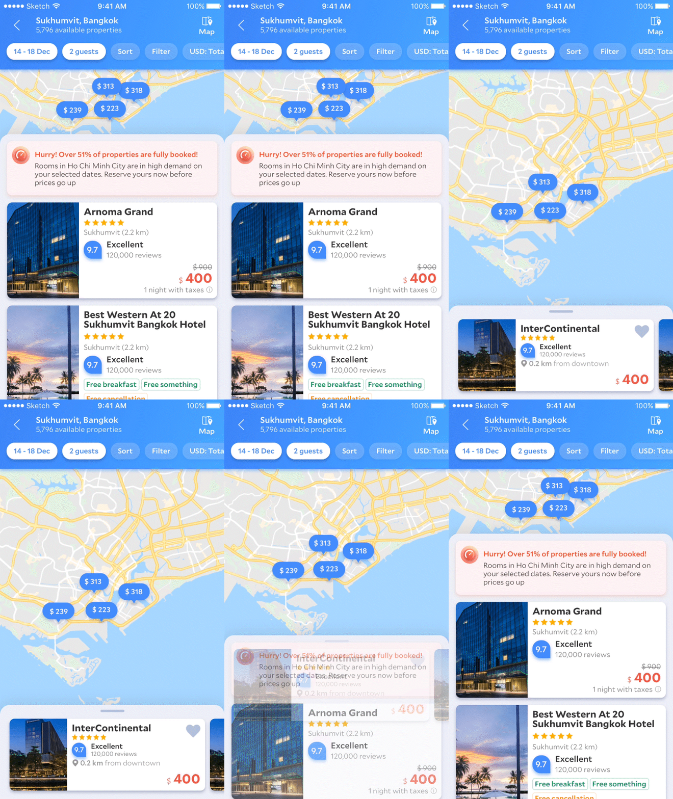
Animation and transitions
Outcome
Velocity on Product Expansion
Launched homepage redesign and continue to push for code/design adoption. Launch the rebrand the was able to continue expand to different product lines.
Reusability and Scalability to Design & Dev
Successfully funded the UI engineering team and built up a business case. And advocate for system thinking and design systems. Benefit tech team to save cost and improve efficiency by introducing reusablity of component library
Agoda Branding to Users
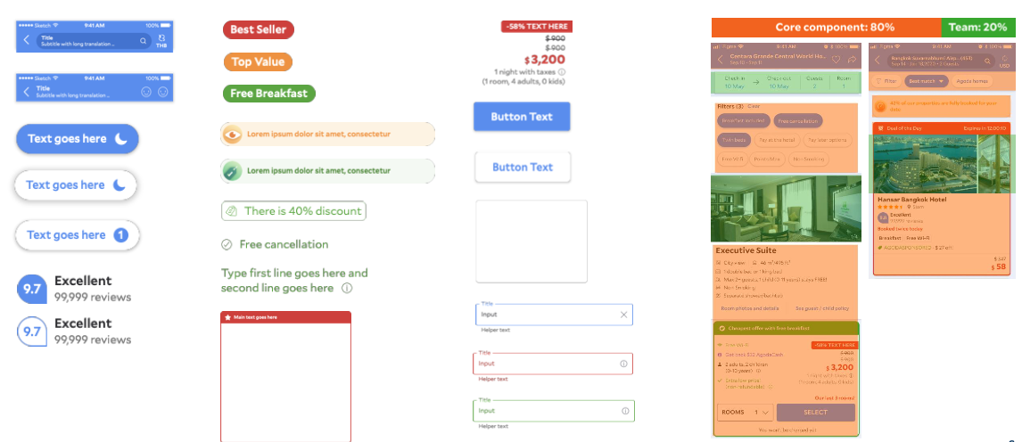
Using 5 colors as design language to highlight different benefit, messaging or system intent.
Total 46 unique components(1,105variants) can cover 80% of core pages
Dev code coverage (Aug 2019 - Jan 2021)
Key Milestones
2019 Q3 - Launched Homepage refresh
2019 Q4 - 2020 Q2 Drove code and design adoption overall to 40%
2020 Q3 onwards - Pivoted the focus to drive core pages adoption to 80%
2020 - 2X the dev and design velocity
2020 - Framework readiness to 90%
2020 - Reached up to 95% design adoption
2020 - Developed a White Label solution with a product launch
How this led to UX Platform Team
The real challenge began here - How might we socialize and advocate the design language. How might we socialize the new design language and accelerate the adoption. How might we educate our users (designers) the new system, components library, design patterns. How might we shift designers’ mindset from individualism design approach to think more systematic and holistic.
If you are interested to learn more stories how I took the challenge, continue read how I led the


