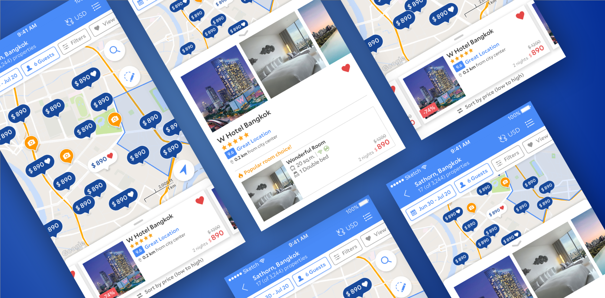
Agoda Maps - App Redesign
Optimizing the map experience across all the platforms. Partnering with a PM and a product designer to test out incremental hypothesis while shape the long term product vision. Think big and take small steps.
Timeline
Sep 2017- Mar 2018 (6 months)
My role
Leading the Maps UX with a product designer on the team
The state of the product
(2017) The maps were very different across all platforms and pages. The new design should provide a consistent experience while tailored to platform-specific pattern and needs of users.
Left column is desktop, middle is apps, right is mobile web pages
Understanding the role of Maps
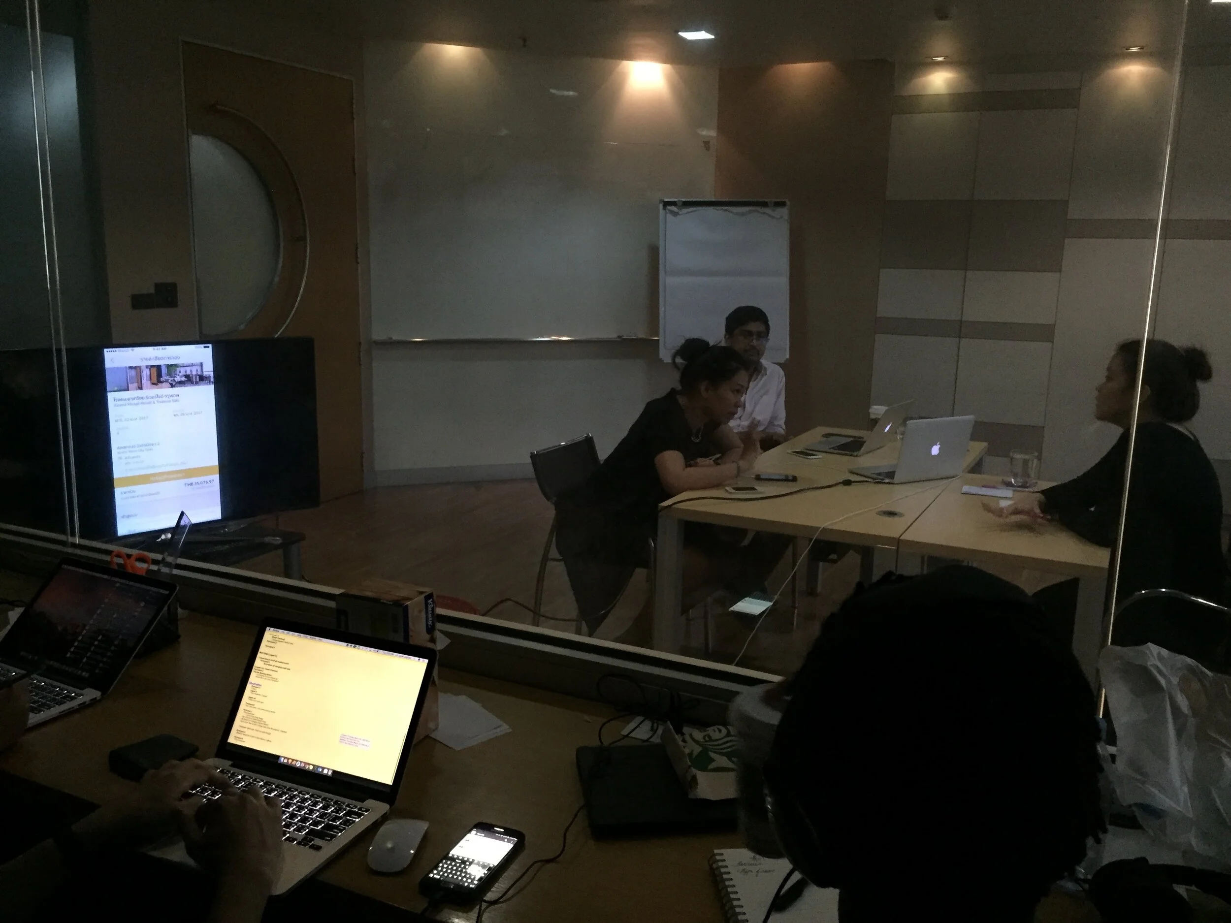
Uncover usability issue, user needs, and top problems with Maps product. We worked with researchers conducted 10 user interviews to find core pain points and the purpose of Map
Where they are
What is around them
What places might be interested to them
How they can get to a place
Product challenges
Discoverability
List view is predominant, how important is map? What are the core use cases?
Experiment ideas: show map view in the fist fold, map search button on homepage
Pin info
What information is most useful when picking a hotel? How do users interact with the map?
Experiment ideas: default zoom level, pin density and information, POI display
Pin and card interaction
How people interact with the results? How do people sort/filter? What are the most important attributes?
Experiment ideas: annotated view vs card view, swipeable cards, sort and filtering results , loading time
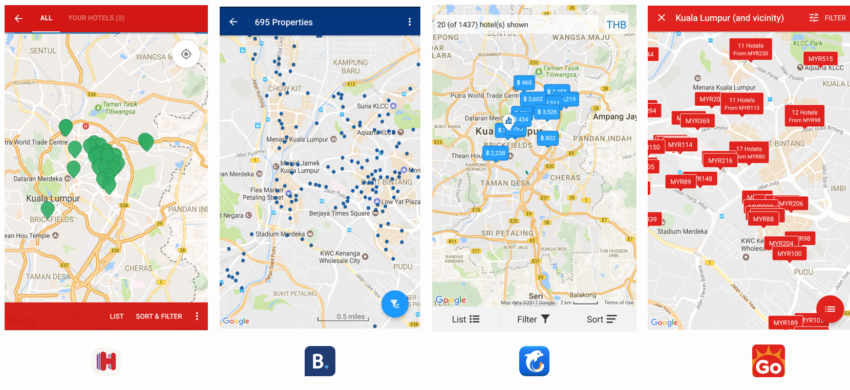
Competitors study (2017)
Design hypothesis #1
Map view discoverability & navigation
As a user, I would like to see map view on search result page so I can access map easily and reduce friction.
Key metrics - We will know this when we see map traffic increase and higher conversion.
*This is wireframe, not the final mockup
Design hypothesis #2
Sort & filter feature parity
As a user, I would like to narrow down the search result by quickly access sort & filter on map view.
Key metrics - We will know this when we see engagement of sort and filter and higher conversion.
*This is wireframe, not the final mockup
*This is wireframe, not the final mockup
Design hypothesis #3
Offer comparison
As a user I would like to compare on map view so that I don’t need to go back and forth on research result and room offers.
Key metrics - We will know this when we see faster task completion time and engagement of carousel.
*This is wireframe, not the final mockup
Work with design engineer to test out the concept
Prototyping and user testing it
Validate hypothesis through AB testing
Map view discoverability
IBPD +300
Significant win on bookers & bookings (both over +1.8%), and a big increase in usage of the map button on home (71.4% increase; from 3.4% of users on A to 5.8% of users on B). Overall +8.5% users going to Search Page Map.
Scarcity and urgency
IBPD +170
Introduced “Sold out“ pins on map which had significant conversion win. Interaction with pin and card (CTR and swipes) is up ~7-8%
More AB experiments - AB, AB1, AB2, and more…
Test swipeable card view, and distance info
Test shared sort & filter, introduce price pin, favorites
Test reversed pin color(improve contrast)
Test auto-populate resulte or manual “Search current area“ button
Design big, and test small
My learnings - by understanding user goals and needs to reimagine the product, considering tech constrains and business impact to find the sweet spot. Define the vision and understand how to break them down into incremental steps and iterate the vision as we go by validating each hypothesis.


